 fluttercn
Components
Card
A versatile container component for grouping related content
Installation
fluttercn add cardUsage
Basic Card
A simple card with custom content:
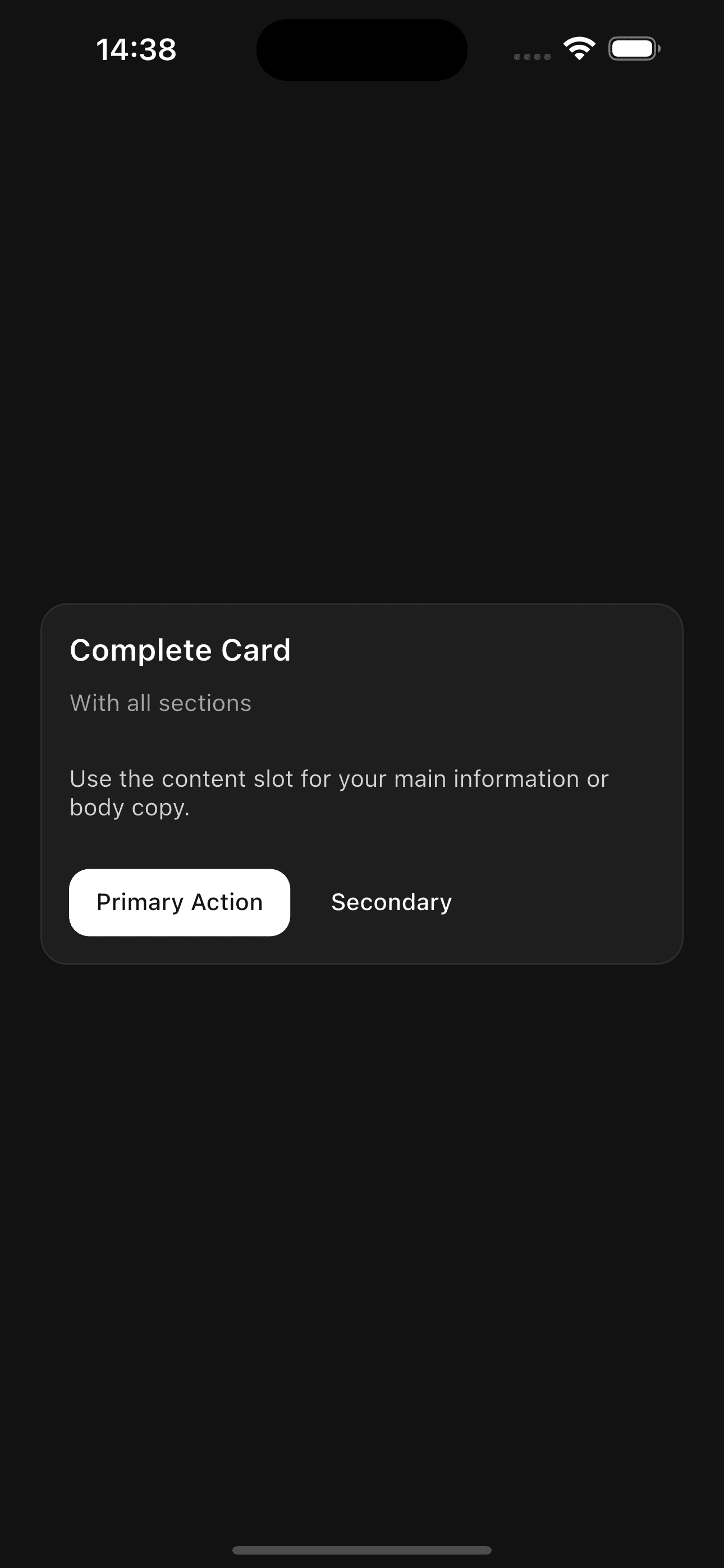
Card(
  header: const CardHeader(
    title: CardTitle('Complete Card'),
    description: CardDescription('With all sections'),
  ),
  content: CardContent(
    child: Text(
      'Use the content slot for your main information or body copy.',
      style: TextStyle(color: AppTheme.textSecondary),
    ),
  ),
  footer: CardFooter(
    child: Row(
      children: [
        Button(
          onPressed: () {},
          child: const Text('Primary Action'),
        ),
        AppTheme.gapHorizontalSm,
        Button(
          variant: ButtonVariant.ghost,
          onPressed: () {},
          child: const Text('Secondary'),
        ),
      ],
    ),
  ),
)
Interactive Card
Cards can be made tappable with the onTap callback:
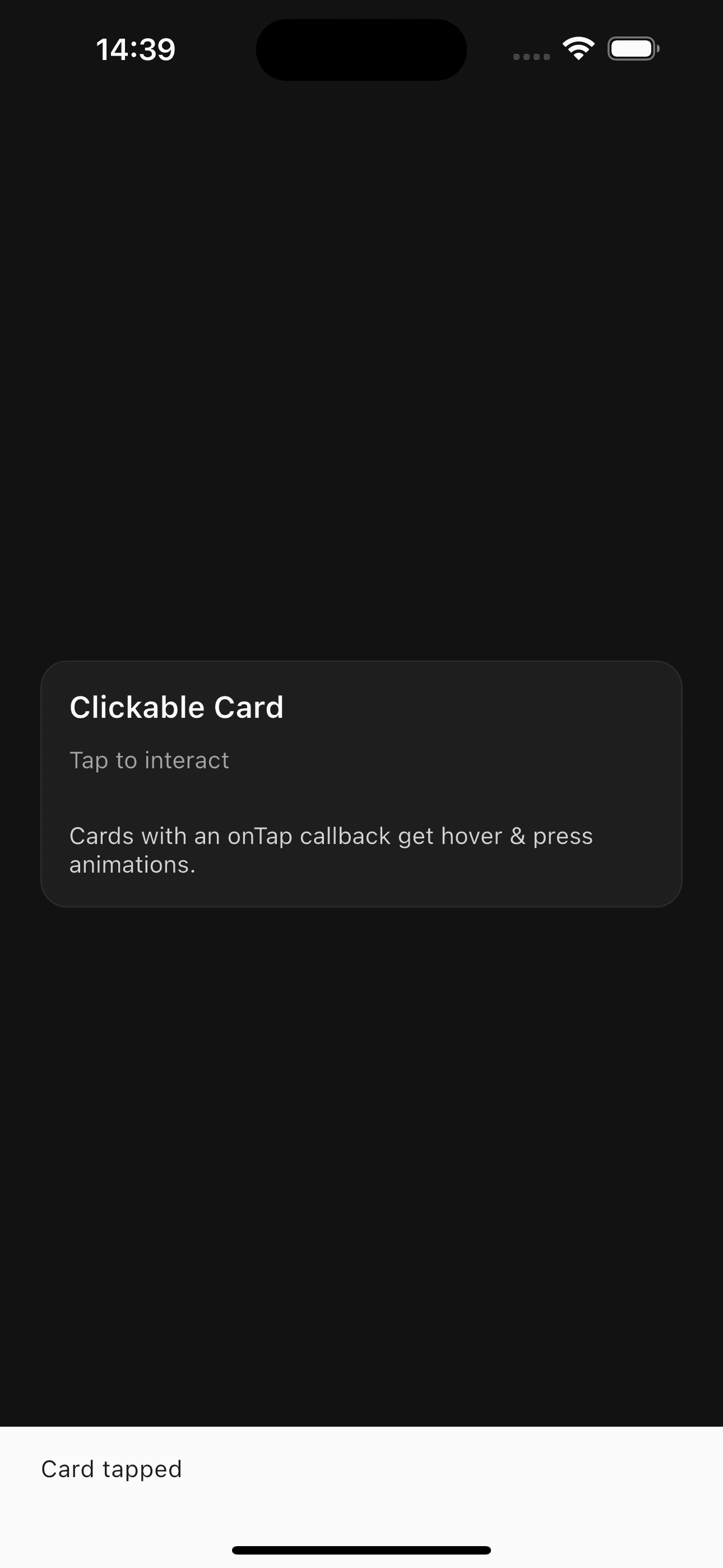
Card(
  onTap: () {
    print('Card tapped');
  },
  header: CardHeader(
    title: CardTitle('Clickable Card'),
    description: CardDescription('Tap to interact'),
  ),
  content: CardContent(
    child: Text('This card responds to taps'),
  ),
)
Card with Dividers
Visually separate sections with dividers:
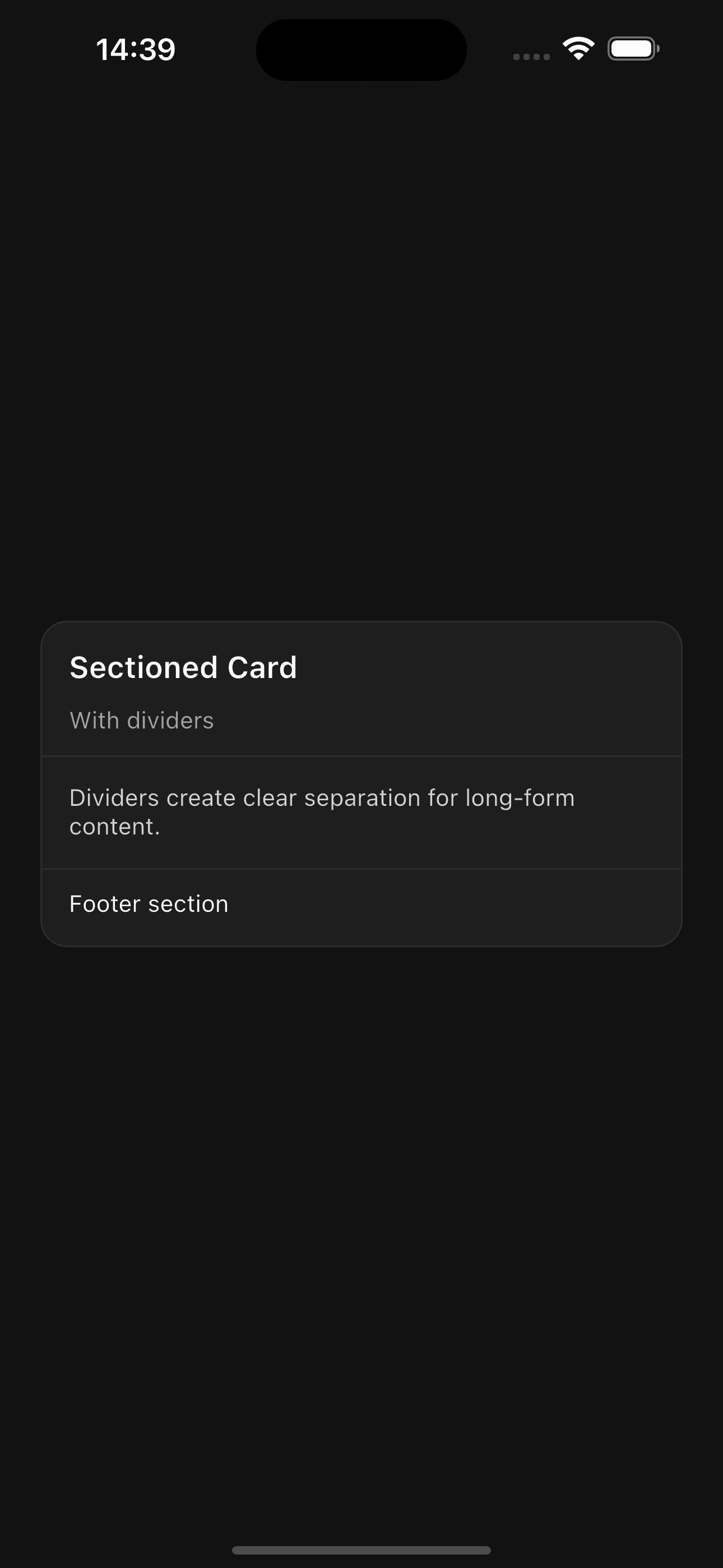
Card(
  showDividers: true,
  header: CardHeader(
    title: CardTitle('Sectioned Card'),
    description: CardDescription('With dividers'),
  ),
  content: CardContent(
    child: Text('Content section'),
  ),
  footer: CardFooter(
    child: Text('Footer section'),
  ),
)
Examples
Profile Card
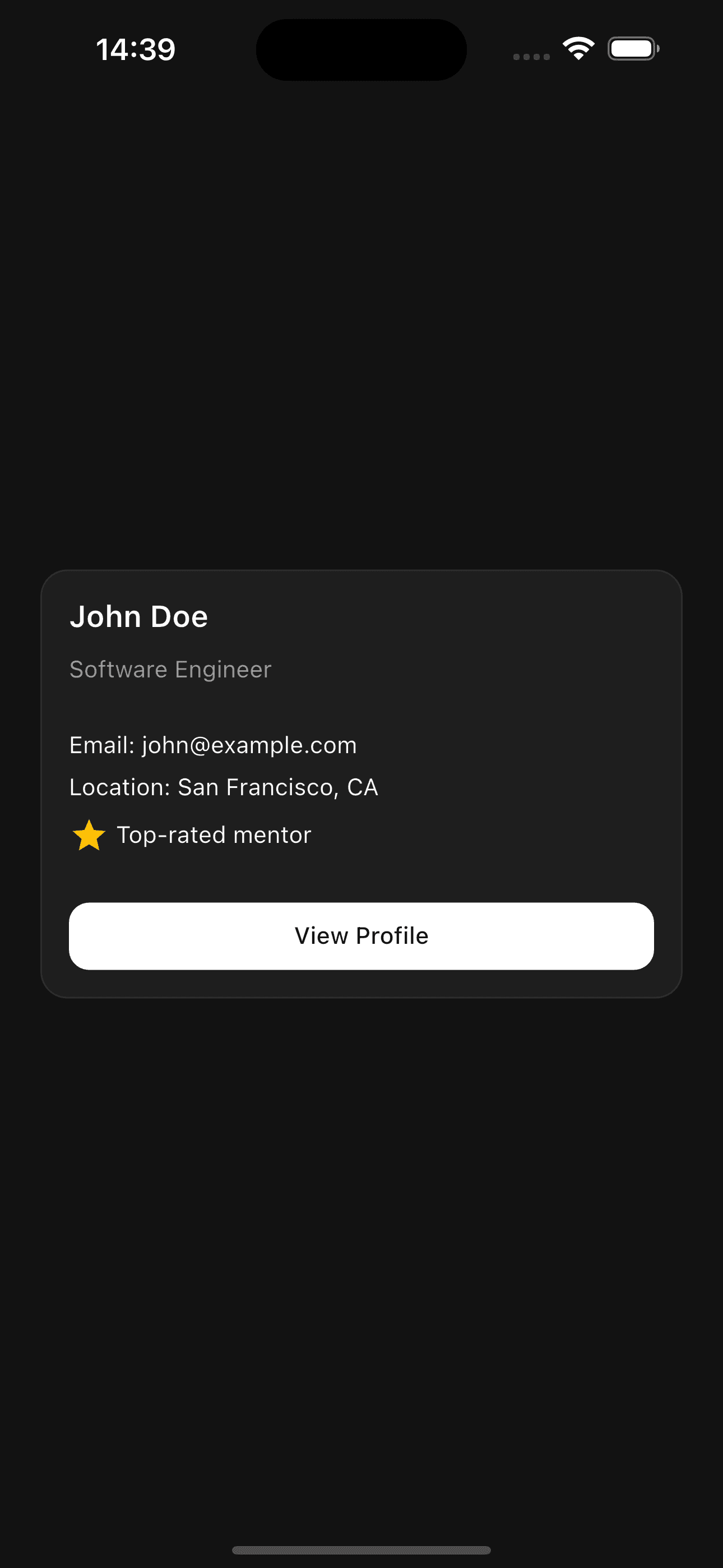
Card(
  header: const CardHeader(
    title: CardTitle('John Doe'),
    description: CardDescription('Software Engineer'),
  ),
  content: CardContent(
    child: Column(
      crossAxisAlignment: CrossAxisAlignment.start,
      children: [
        const Text('Email: john@example.com'),
        AppTheme.gapSm,
        const Text('Location: San Francisco, CA'),
        AppTheme.gapSm,
        Row(
          children: const [
            Icon(Icons.star, color: Colors.amber),
            SizedBox(width: 4),
            Text('Top-rated mentor'),
          ],
        ),
      ],
    ),
  ),
  footer: CardFooter(
    child: Button(
      onPressed: () {},
      child: const Text('View Profile'),
    ),
  ),
)
API Reference
Card
| Property | Type | Default | Description |
|---|---|---|---|
header | CardHeader? | null | Header section with title and description |
content | CardContent? | null | Main content area |
footer | CardFooter? | null | Footer section for actions |
child | Widget? | null | Single child for simple cards (cannot be used with header/content/footer) |
onTap | VoidCallback? | null | Callback when card is tapped |
padding | EdgeInsets? | null | Custom padding (only for single child mode) |
showDividers | bool | false | Show dividers between sections |
CardHeader
| Property | Type | Default | Description |
|---|---|---|---|
title | CardTitle? | null | Card title widget |
description | CardDescription? | null | Card description widget |
child | Widget? | null | Custom header content (cannot be used with title/description) |
padding | EdgeInsets? | null | Custom padding |
CardTitle
| Property | Type | Default | Description |
|---|---|---|---|
text | String | required | The title text |
style | TextStyle? | null | Custom text style |
CardDescription
| Property | Type | Default | Description |
|---|---|---|---|
text | String | required | The description text |
style | TextStyle? | null | Custom text style |
CardContent
| Property | Type | Default | Description |
|---|---|---|---|
child | Widget | required | Content widget |
padding | EdgeInsets? | null | Custom padding |
CardFooter
| Property | Type | Default | Description |
|---|---|---|---|
child | Widget | required | Footer widget |
padding | EdgeInsets? | null | Custom padding |
Features
- Composable Structure - Build cards with separate header, content, and footer sections
- Interactive - Built-in tap handling with scale animation and hover effects
- Flexible - Use simple single-child mode or full composable structure
- Themed - Automatically adapts to your app's theme
- Dividers - Optional visual separation between sections
Cards automatically handle hover states and press animations when onTap is
provided.
Customization
Custom Padding
Card(
  header: CardHeader(
    title: CardTitle('Custom Spacing'),
    padding: EdgeInsets.all(24),
  ),
  content: CardContent(
    padding: EdgeInsets.symmetric(horizontal: 24, vertical: 16),
    child: Text('Custom padded content'),
  ),
)
Custom Styles
CardTitle(
  'Styled Title',
  style: TextStyle(
    fontSize: 24,
    color: Colors.blue,
    fontWeight: FontWeight.bold,
  ),
)
Do not use both child and header/content/footer together. Choose either
the simple single-child approach or the composable structure.