 fluttercn
Components
Dropdown
A customizable dropdown select component for choosing from a list of options
Installation
fluttercn add dropdownUsage
Basic Dropdown
Simple dropdown with options:
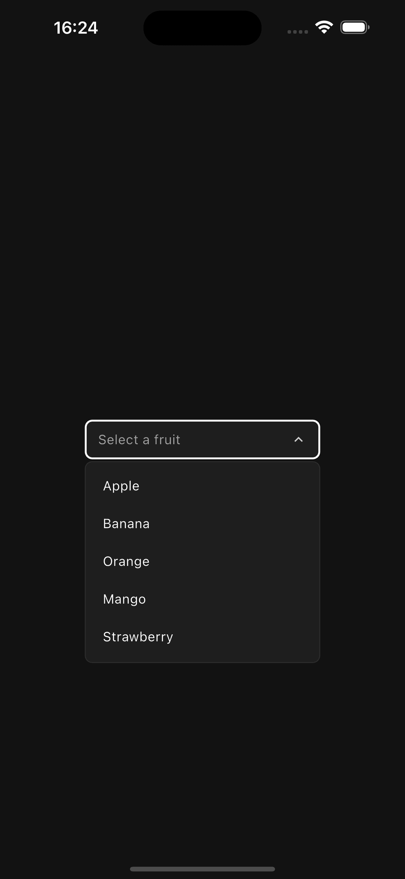
Dropdown<String>(
  value: selectedValue,
  placeholder: 'Select an option',
  items: [
    DropdownItem(value: 'apple', label: 'Apple'),
    DropdownItem(value: 'banana', label: 'Banana'),
    DropdownItem(value: 'orange', label: 'Orange'),
  ],
  onChanged: (value) {
    setState(() => selectedValue = value);
  },
)
Dropdown with Label
Dropdown with label and description:
Dropdown<String>(
  value: selectedFruit,
  placeholder: 'Choose a fruit',
  label: 'Favorite Fruit',
  description: 'Select your favorite fruit from the list',
  items: [
    DropdownItem(value: 'apple', label: 'Apple'),
    DropdownItem(value: 'banana', label: 'Banana'),
    DropdownItem(value: 'orange', label: 'Orange'),
  ],
  onChanged: (value) {
    setState(() => selectedFruit = value);
  },
)
Sizes
Three predefined sizes for different contexts:
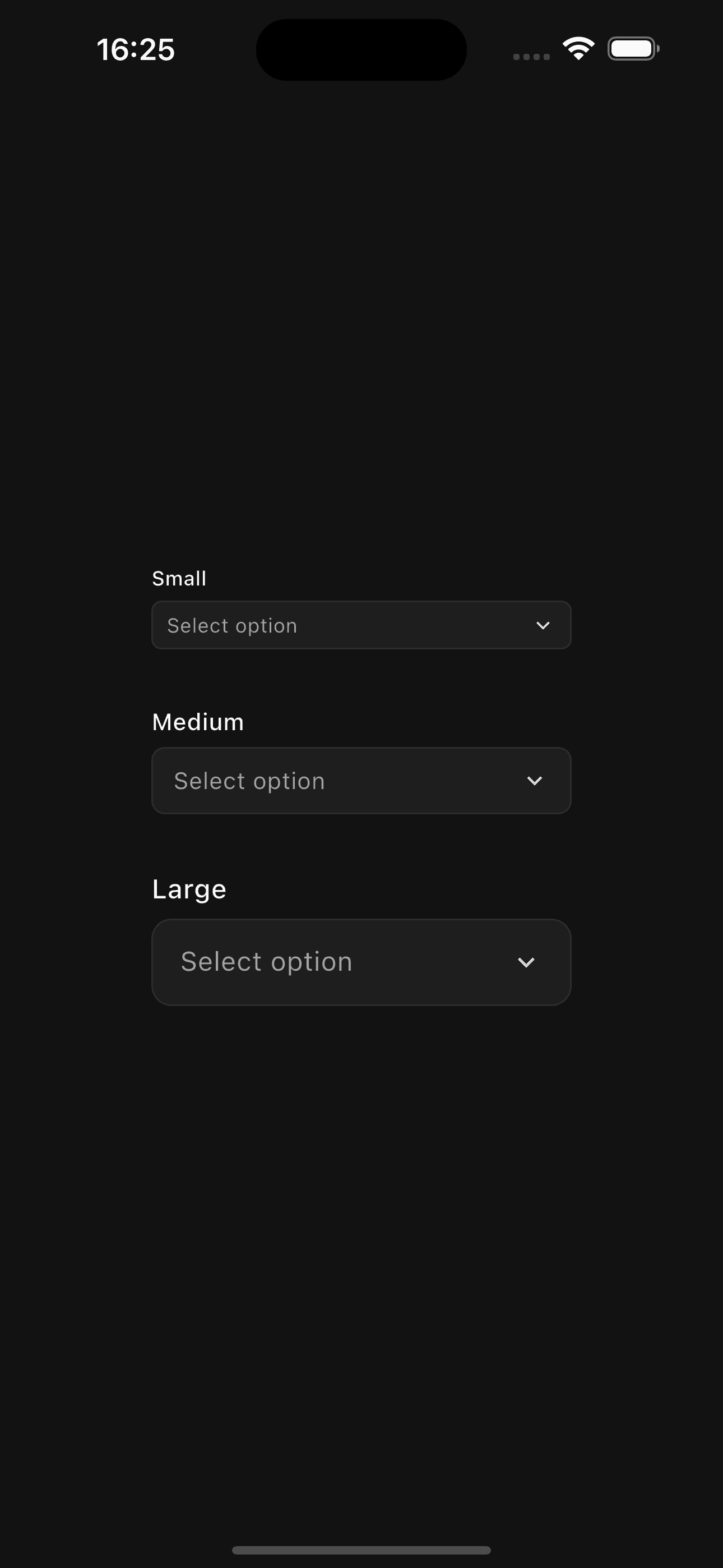
// Small
Dropdown<String>(
  value: value,
  size: DropdownSize.sm,
  items: items,
  onChanged: (value) {},
)

// Medium (default)
Dropdown<String>(
  value: value,
  size: DropdownSize.md,
  items: items,
  onChanged: (value) {},
)

// Large
Dropdown<String>(
  value: value,
  size: DropdownSize.lg,
  items: items,
  onChanged: (value) {},
)
With Icons
Add icons to dropdown items for better visual context:
Dropdown<String>(
  value: theme,
  label: 'Theme',
  items: [
    DropdownItem(
      value: 'light',
      label: 'Light',
      icon: Icons.light_mode,
    ),
    DropdownItem(
      value: 'dark',
      label: 'Dark',
      icon: Icons.dark_mode,
    ),
    DropdownItem(
      value: 'system',
      label: 'System',
      icon: Icons.settings_brightness,
    ),
  ],
  onChanged: (value) {
    setState(() => theme = value);
  },
)
With Descriptions
Add descriptions to items for additional context:

Dropdown<String>(
value: plan,
label: 'Subscription Plan',
items: [
DropdownItem(
value: 'free',
label: 'Free',
description: 'Basic features for personal use',
icon: Icons.person,
),
DropdownItem(
value: 'pro',
label: 'Pro',
description: 'Advanced features for professionals',
icon: Icons.star,
),
DropdownItem(
value: 'team',
label: 'Team',
description: 'Collaboration tools for teams',
icon: Icons.group,
),
],
onChanged: (value) {
setState(() => plan = value);
},
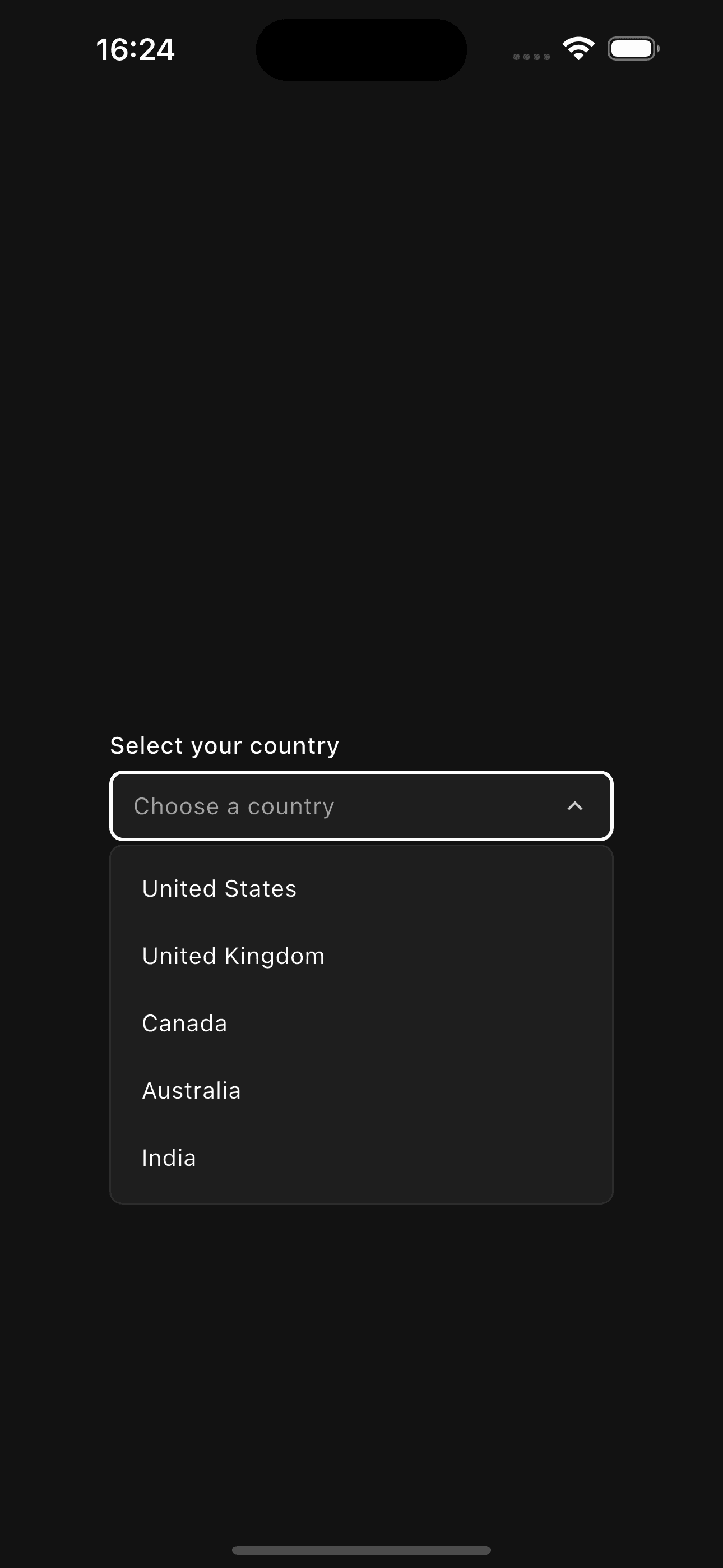
)Error State
Show validation errors:
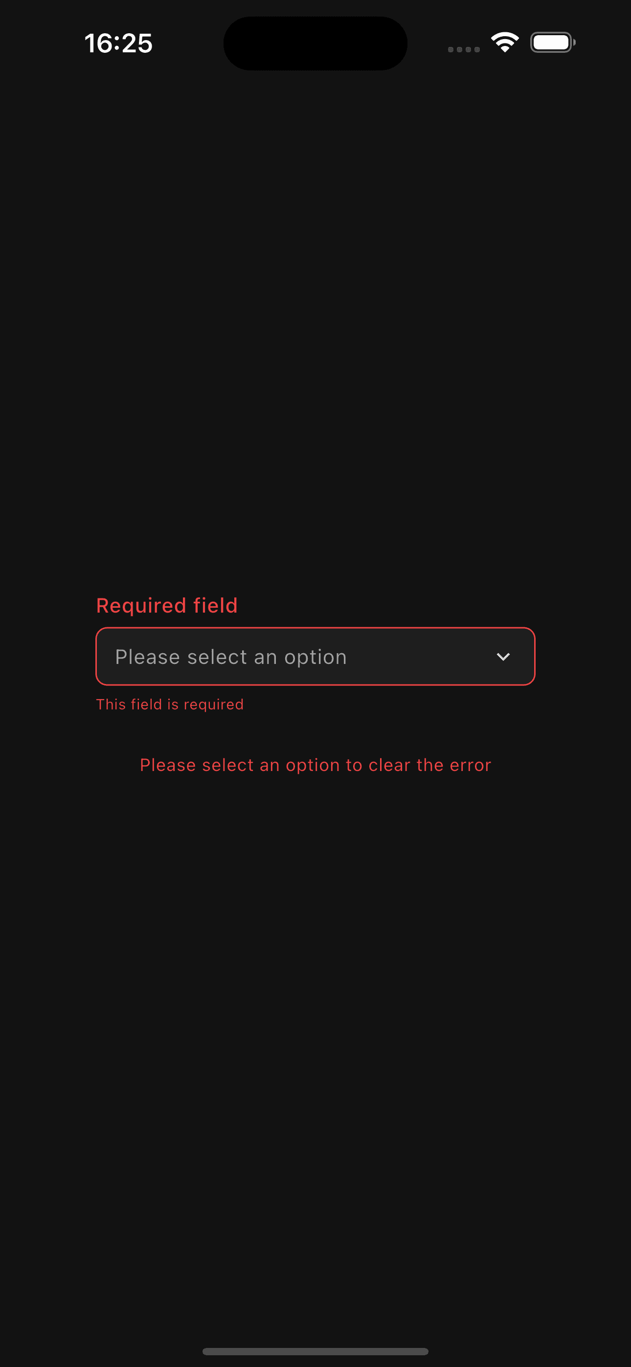
Dropdown<String>(
  value: null,
  label: 'Country',
  placeholder: 'Select your country',
  error: true,
  errorText: 'Please select a country',
  items: [
    DropdownItem(value: 'us', label: 'United States'),
    DropdownItem(value: 'uk', label: 'United Kingdom'),
    DropdownItem(value: 'ca', label: 'Canada'),
  ],
  onChanged: (value) {
    setState(() => selectedCountry = value);
  },
)
Disabled State
Disable dropdown interactions:
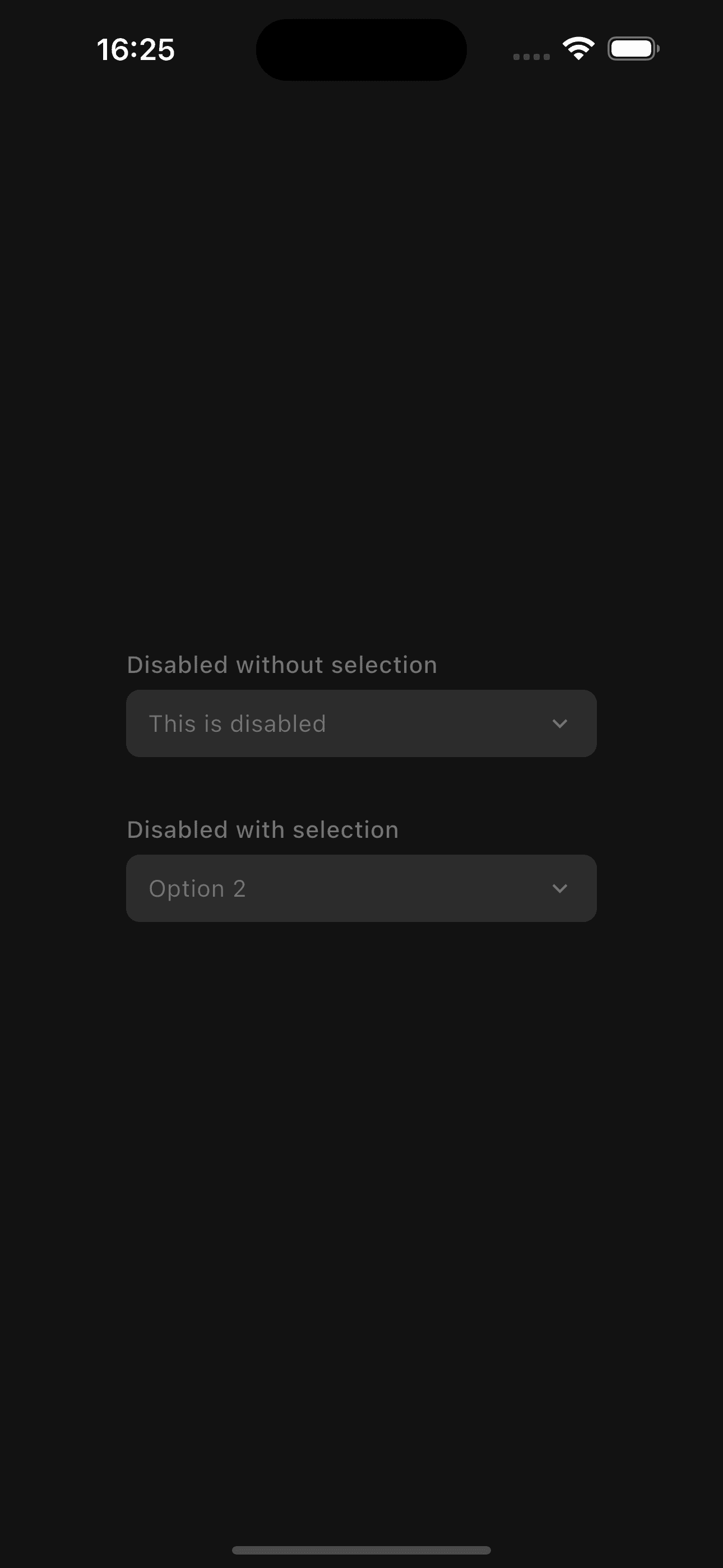
Dropdown<String>(
  value: 'option1',
  disabled: true,
  items: [
    DropdownItem(value: 'option1', label: 'Option 1'),
    DropdownItem(value: 'option2', label: 'Option 2'),
  ],
  onChanged: (value) {},
)
Examples
Form with Validation
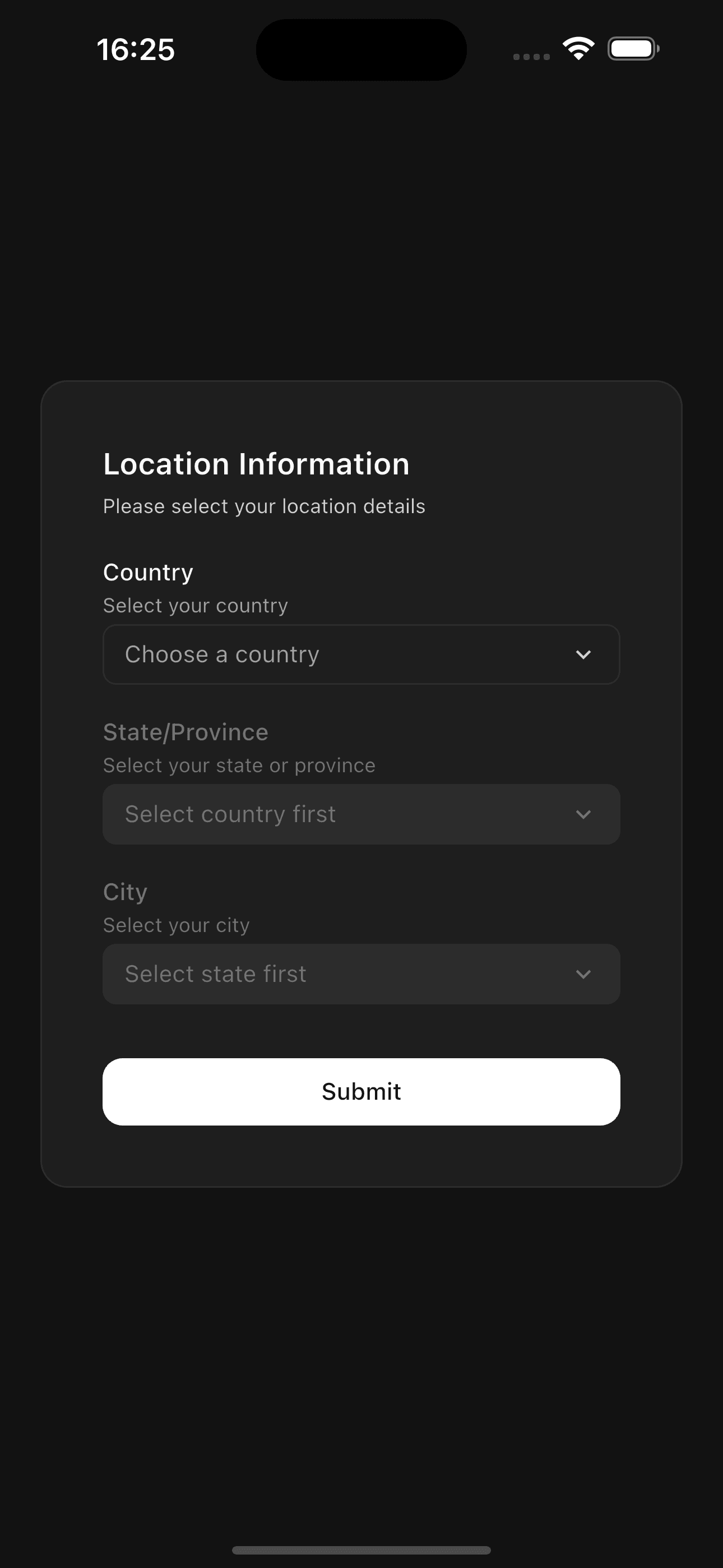
class FormWithDropdown extends StatefulWidget {
  @override
  State<FormWithDropdown> createState() => _FormWithDropdownState();
}

class _FormWithDropdownState extends State<FormWithDropdown> {
  String? country;
  bool showError = false;

  void _validateAndSubmit() {
    if (country == null) {
      setState(() => showError = true);
      return;
    }

    // Submit form
    print('Selected country: $country');
  }

  @override
  Widget build(BuildContext context) {
    return Column(
      children: [
        Dropdown<String>(
          value: country,
          label: 'Country *',
          placeholder: 'Select your country',
          error: showError && country == null,
          errorText: showError && country == null
              ? 'Country is required'
              : null,
          items: [
            DropdownItem(value: 'us', label: 'United States'),
            DropdownItem(value: 'uk', label: 'United Kingdom'),
            DropdownItem(value: 'ca', label: 'Canada'),
            DropdownItem(value: 'au', label: 'Australia'),
          ],
          onChanged: (value) {
            setState(() {
              country = value;
              showError = false;
            });
          },
        ),
        SizedBox(height: AppTheme.spaceLg),
        Button(
          onPressed: _validateAndSubmit,
          fullWidth: true,
          child: Text('Submit'),
        ),
      ],
    );
  }
}
API Reference
Dropdown
| Property | Type | Default | Description |
|---|---|---|---|
items | List<DropdownItem<T>> | required | List of dropdown items |
onChanged | ValueChanged<T?>? | required | Callback when selection changes |
value | T? | null | Current selected value |
placeholder | String | Select an option | Placeholder text |
label | String? | null | Optional label text |
description | String? | null | Optional description |
size | DropdownSize | md | Dropdown size |
disabled | bool | false | Disable interactions |
error | bool | false | Show error state |
errorText | String? | null | Error message |
width | double? | null | Optional width constraint |
DropdownItem
| Property | Type | Default | Description |
|---|---|---|---|
value | T | required | Value of the item |
label | String | required | Display label |
icon | IconData? | null | Optional icon |
description | String? | null | Optional description text |
DropdownSize
sm- Small (compact size)md- Medium (default size)lg- Large (spacious size)
Features
- Type Safe - Generic type support for any value type
- Customizable Sizes - Three size options for different contexts
- Icons Support - Add icons to both trigger and items
- Item Descriptions - Add secondary text to items
- Keyboard Navigation - Full keyboard support (coming soon)
- Validation States - Built-in error states and messages
- Smooth Animations - Scale and rotation animations
- Hover Effects - Visual feedback on hover
- Custom Width - Flexible width constraints
- Themed - Automatically adapts to light/dark mode
The dropdown automatically closes when clicking outside or selecting an item. The overlay positioning is smart and adjusts based on available screen space.
Make sure to provide unique values for each DropdownItem. Using duplicate
values may cause unexpected selection behavior.
Best Practices
- Use clear, concise labels for dropdown items
- Add icons when they provide meaningful context
- Use descriptions for items that need additional explanation
- Show error states with helpful error messages
- Provide a meaningful placeholder text
- Use
disabledstate for unavailable options - Keep the number of items reasonable (consider search for long lists)
- Use appropriate size for the context (sm for compact UIs, lg for forms)
- Always handle the
onChangedcallback - Use generic types appropriately (e.g.,
Dropdown<int>for numeric values)